Graphic illustration
Our graphic illustration style uses simple shapes to bring to life complex ideas. The following principles encompass thought-provoking imagery through a minimal approach to execution. For appropriate colour combinations and accessibility, please refer to the colour section of this playbook.
Categories
The UOW Graphic illustration style covers four different styles, which can be used for different application types. They are as follows:


Solid colour
Solid colour illustrations are best used when imagery is the driver, where text takes a back seat. For example in an image-led animation or GIF.
Solid colour illustrations are bold and beautiful. Embrace the use of block colour or white backgrounds, layering and scale. We recommend using up to three brand colours at a time.


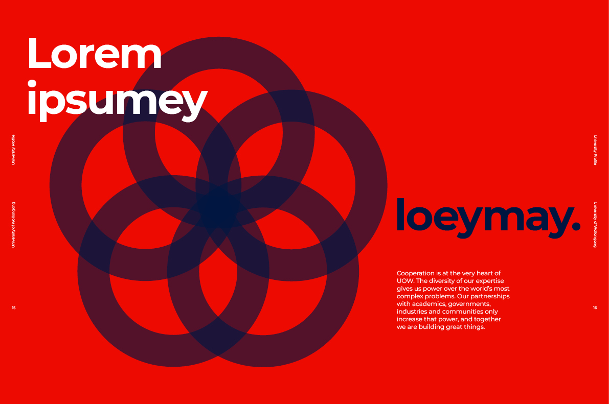
Duo-tone
Duo-tone illustrations are best used when there is a need for copy to go over the top of an illustration. For example, new chapters or a sectional breather in course guides.
Duo-tone illustrations adopt a 'two's company' principle. Block colour backgrounds, and up to two brand colours are preferred. For added depth and dimension, remember to use varying opacity levels in colour to create transparency.


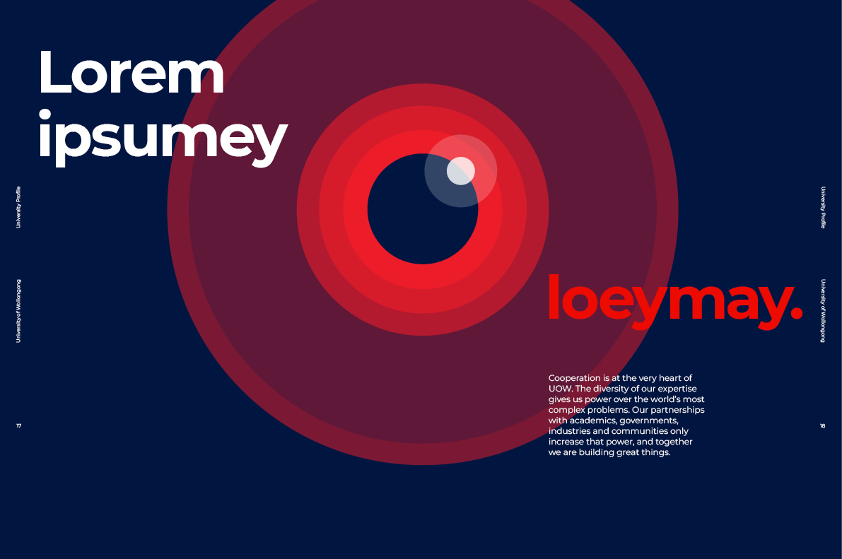
Tri-tone
Tri-tone illustrations are best used as full bleed when detail is required. For example, header banner images and animations.
Tri-tone illustrations work in the same way as duo-tone. Block colour backgrounds are used, and up to three brand colours, (with the inclusion of white). For added depth and dimension, remember to use varying opacity levels in colour to create transparency and layered meaning.


Negative space
Negative space illustrations are best used in isolation when full bleed is not optimal. For example, when an illustration appears mid-story on web pages, such as ‘The Stand’ or as a level up from an icon.
As a general rule, use your surroundings. Use negative space from background, up to three brand colours in each execution and solid colour or transparencies.


Guidance
Maintaining our graphic illustration style is key to our brand consistency. Consider the following points of guidance when commissioning or creating graphic illustrations.


In application
Publications