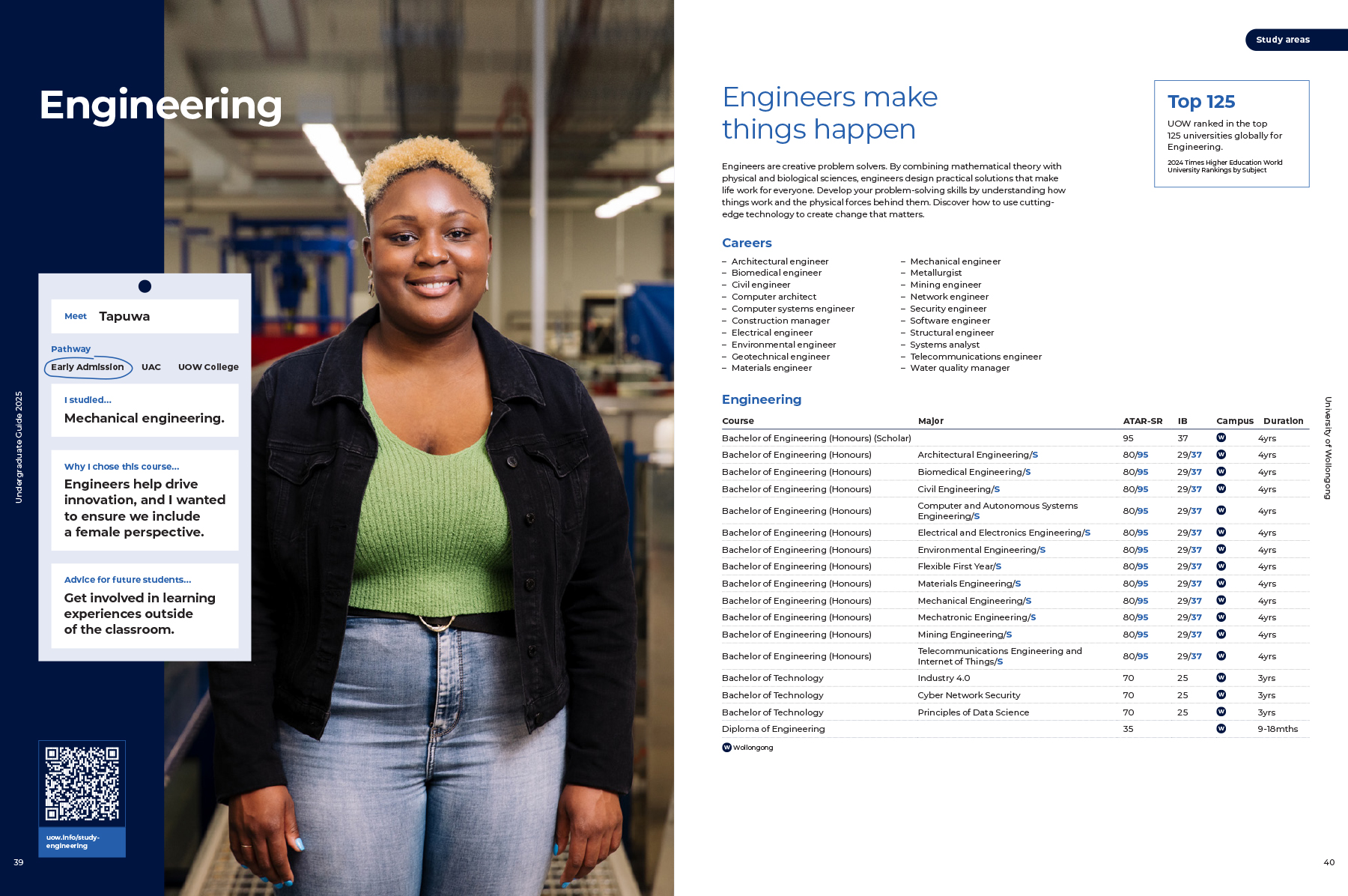
Typography
Our typography and its application should be used to support the core message of your communications. With our contemporary typeface, communications with personality and interest can be produced.
Get UOW typography
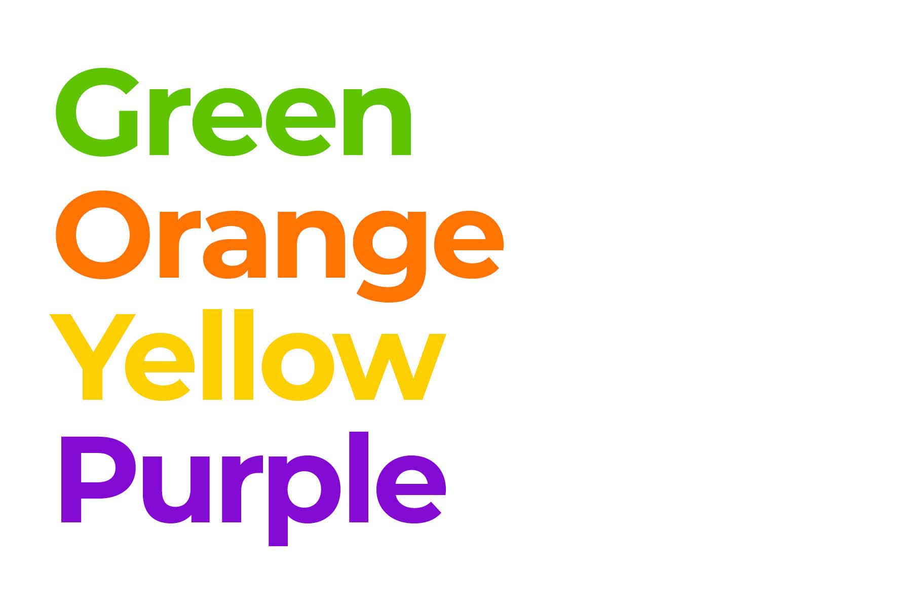
Primary typeface
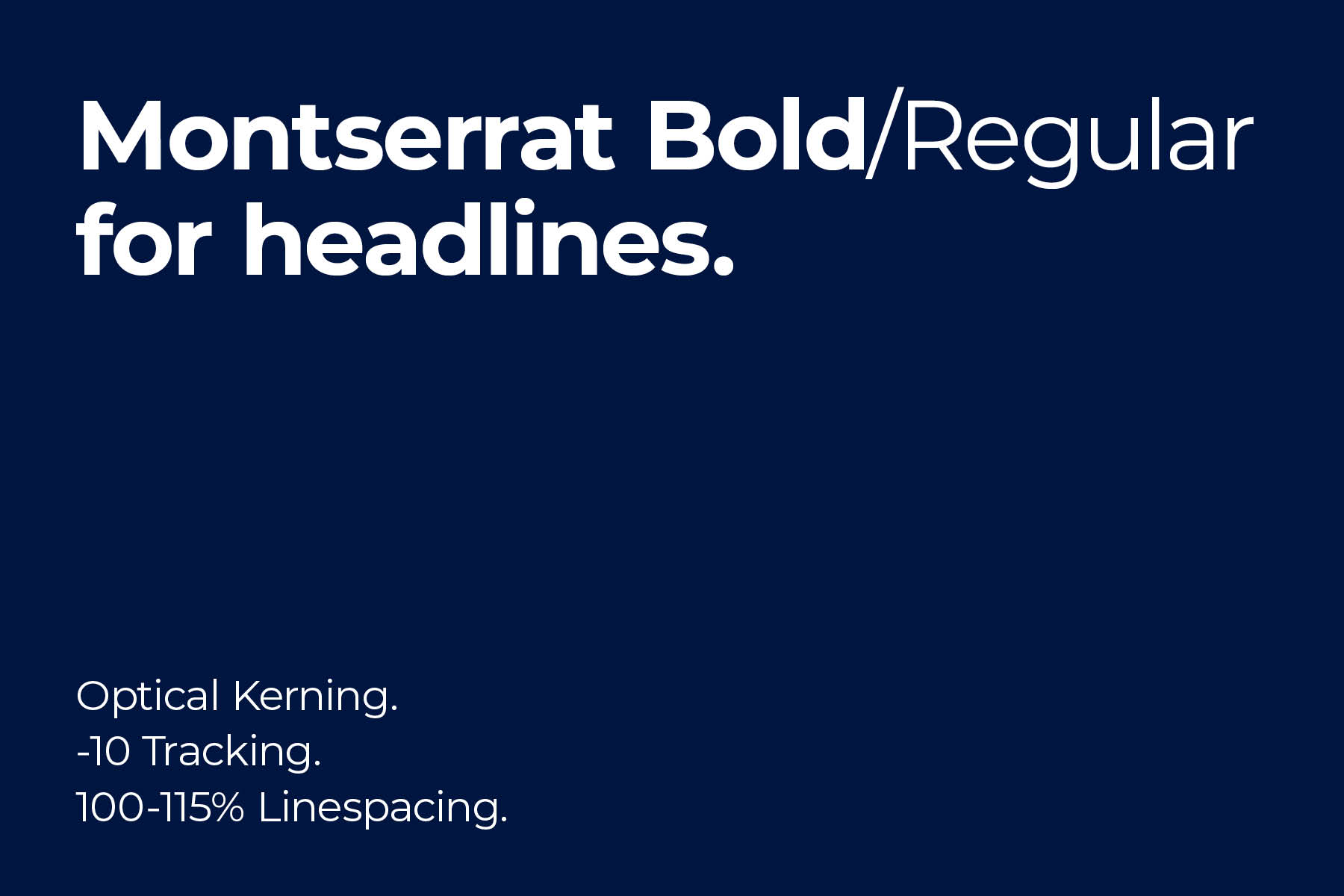
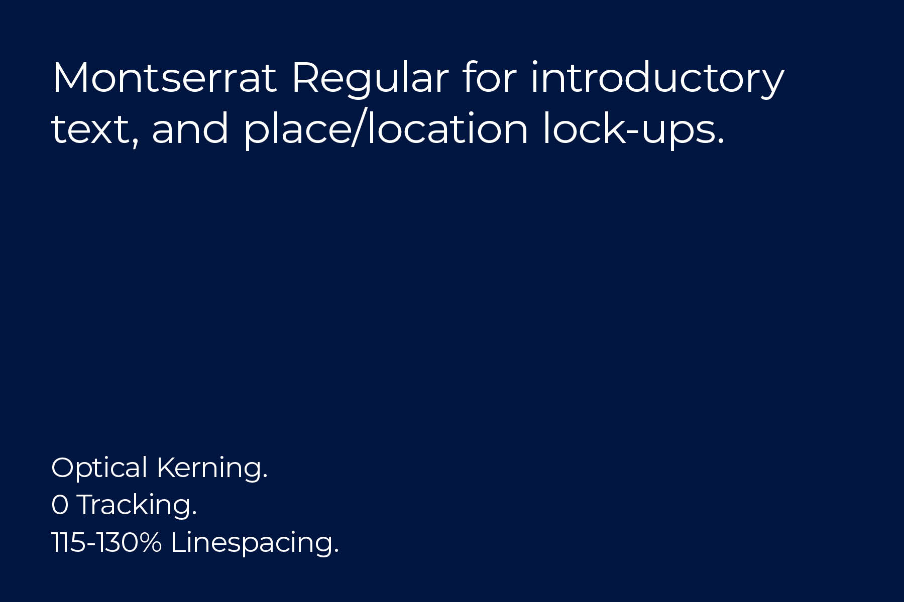
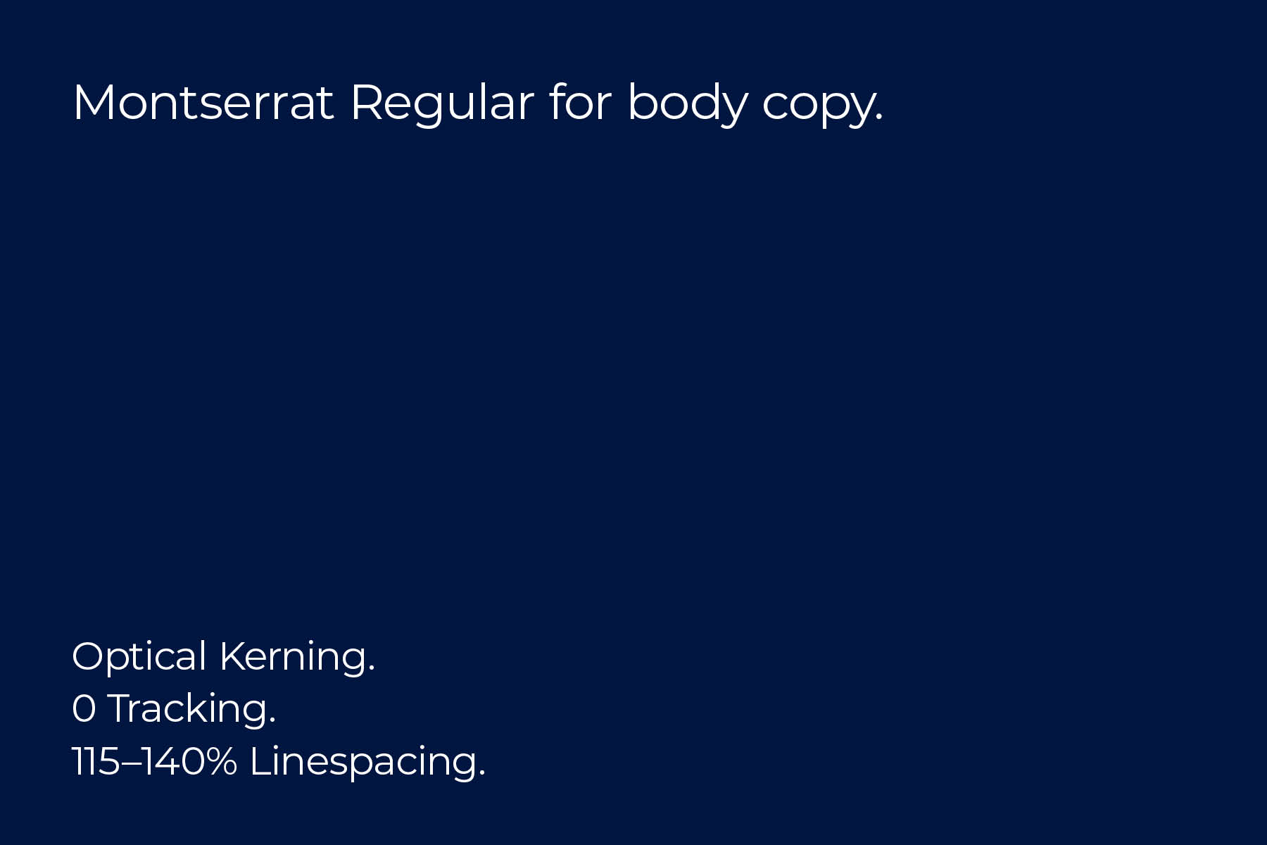
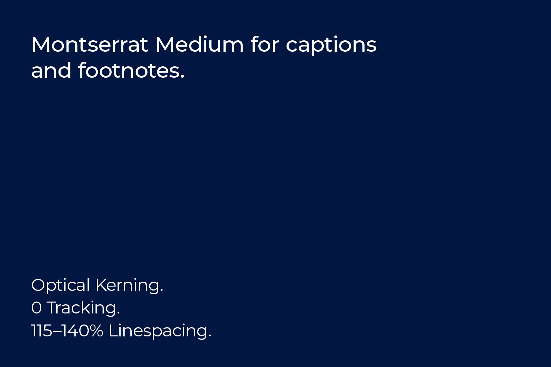
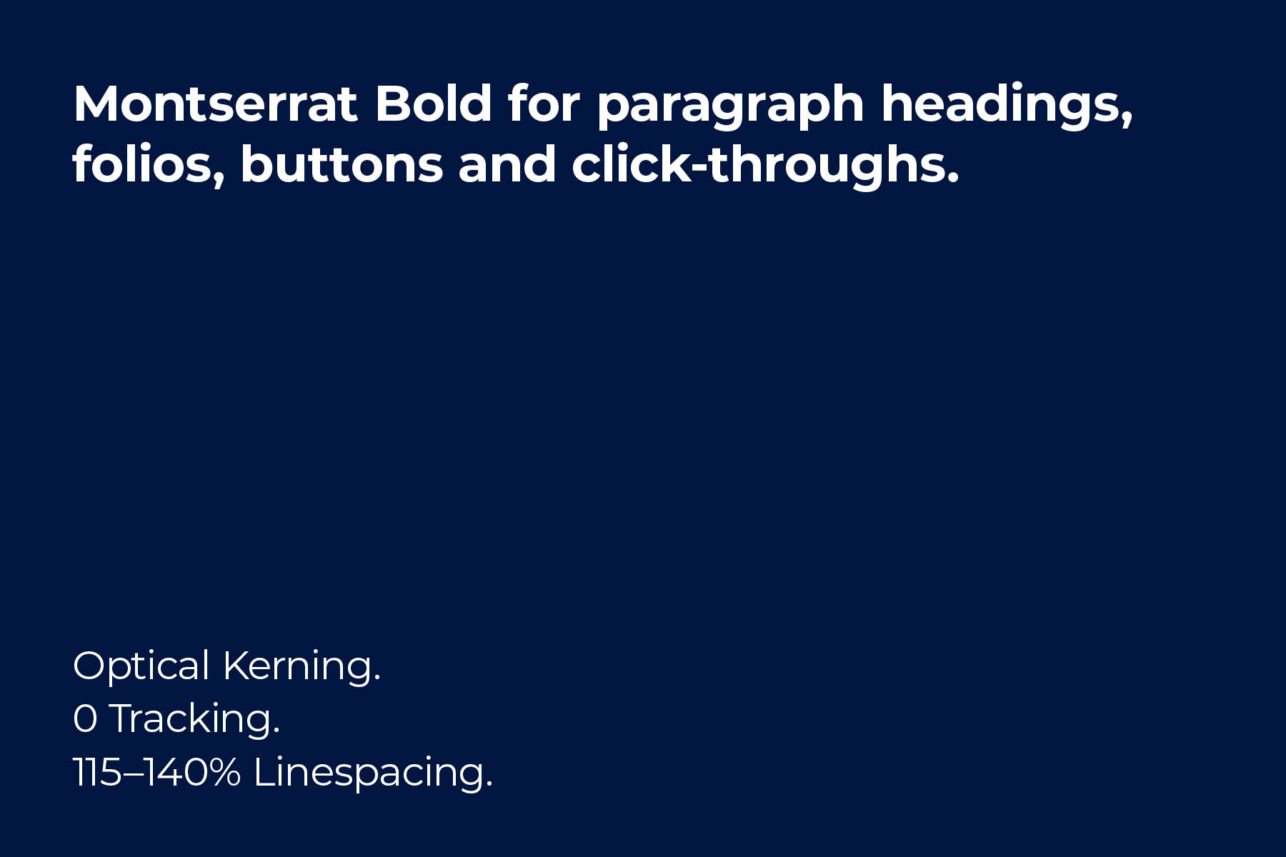
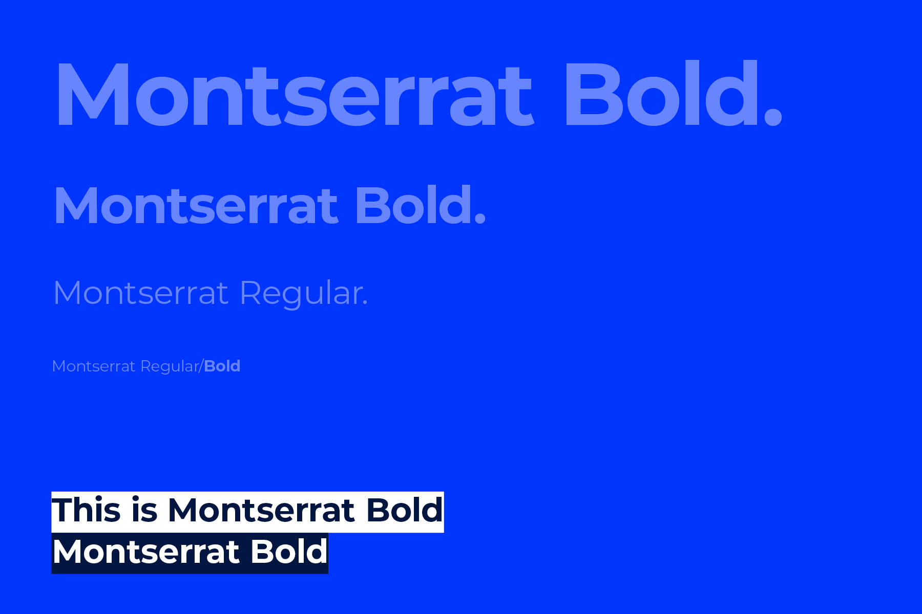
Montserrat is our primary typeface. This bold and contemporary sans-serif typeface comes in a variety of weights – four of which we recommend for use. Where possible, set paragraph text in sentence case.
Highlights
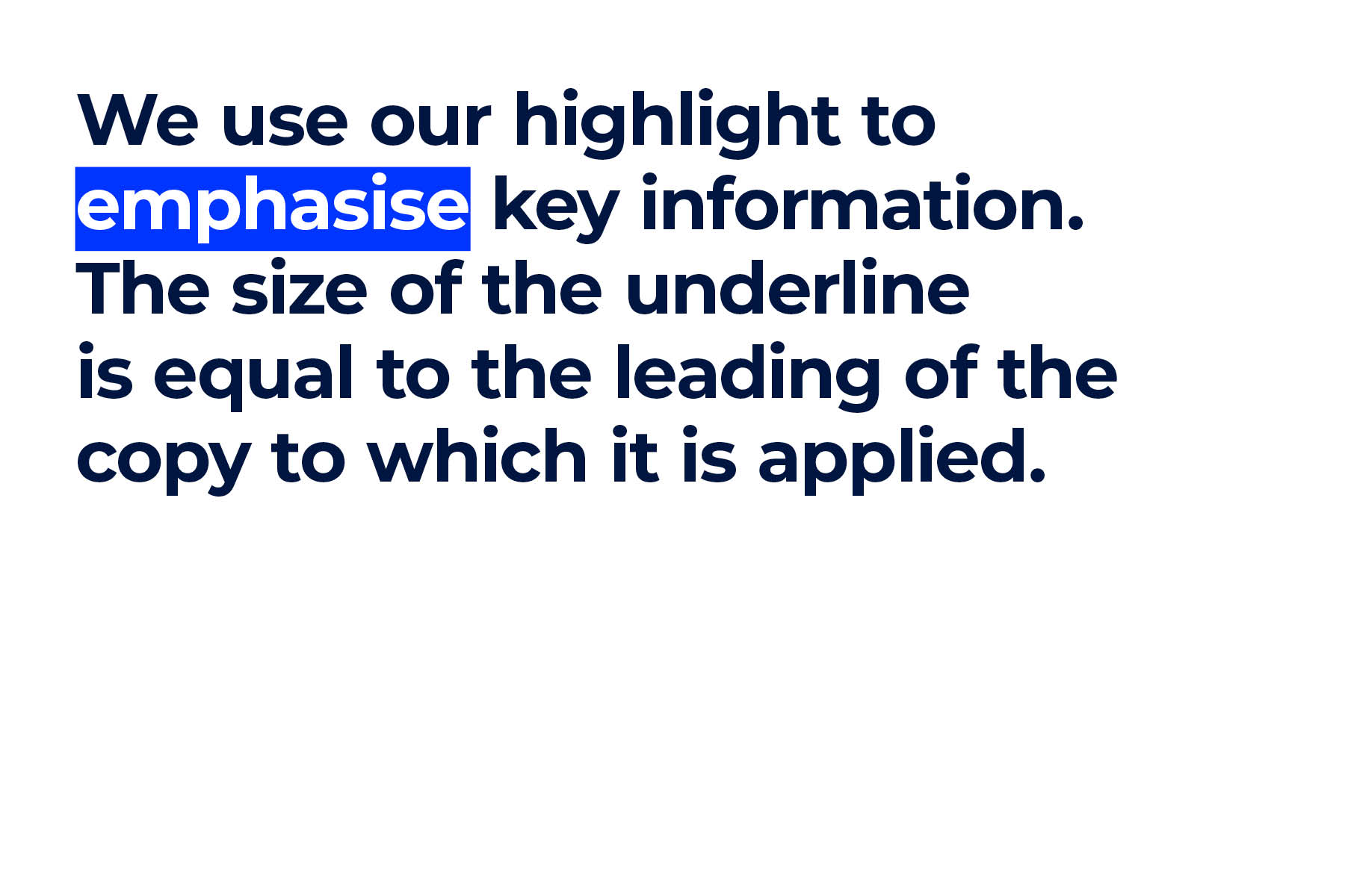
We use our highlight to emphasise key information. It can be used in place of the UOW framework to create distinctive applications with an emphasis on type. The size of the underline is equal to the leading of the copy to which it is applied – and is offset to align to the centre of the text.
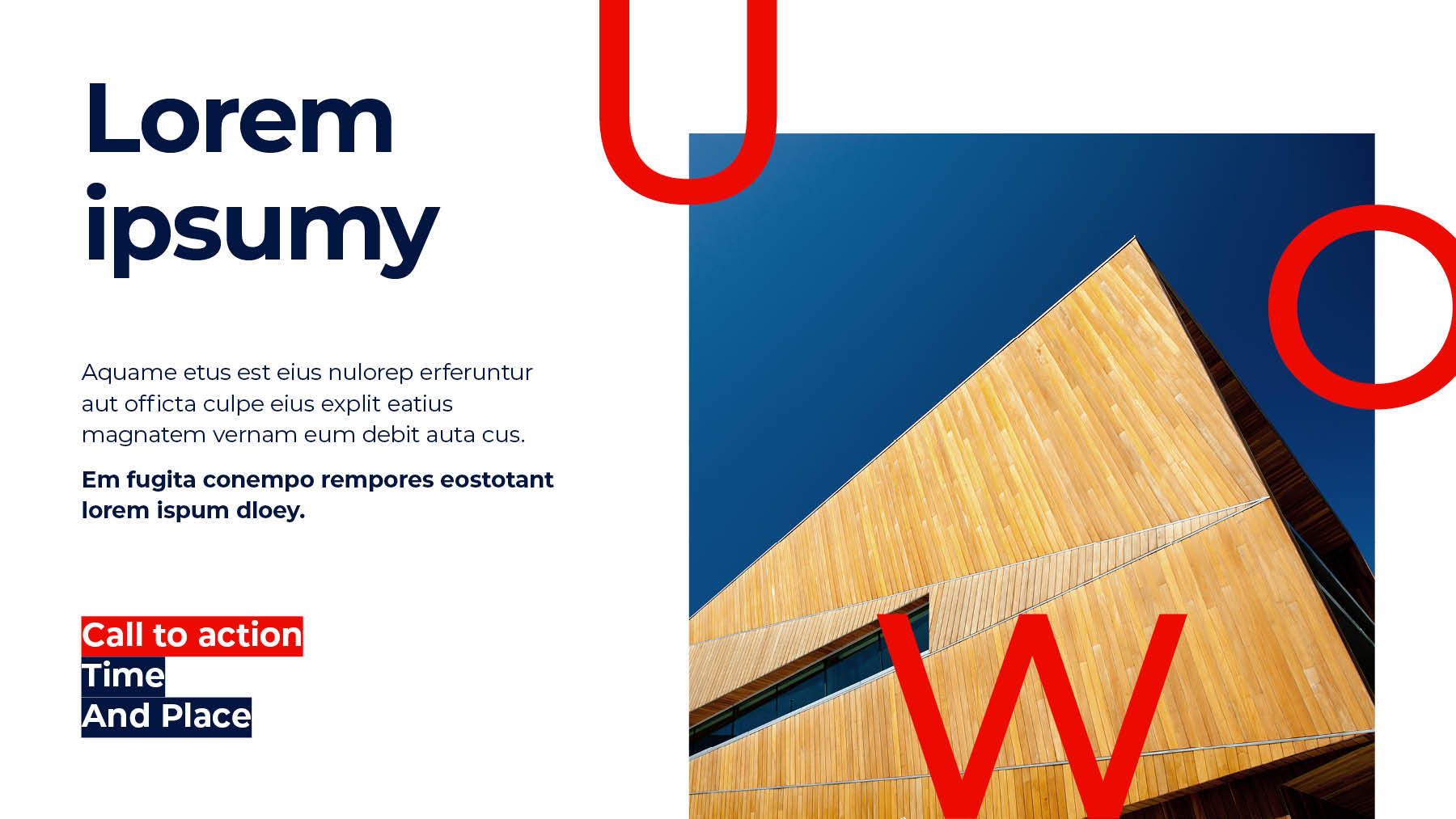
Using highlights
There are two ways that highlights can be used.
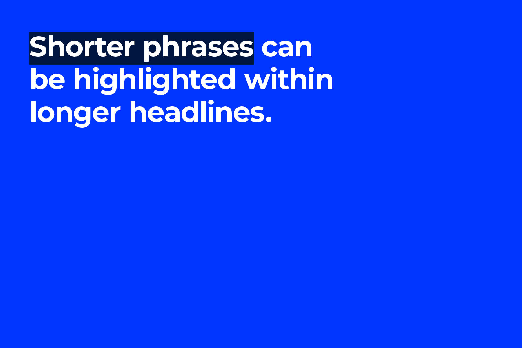
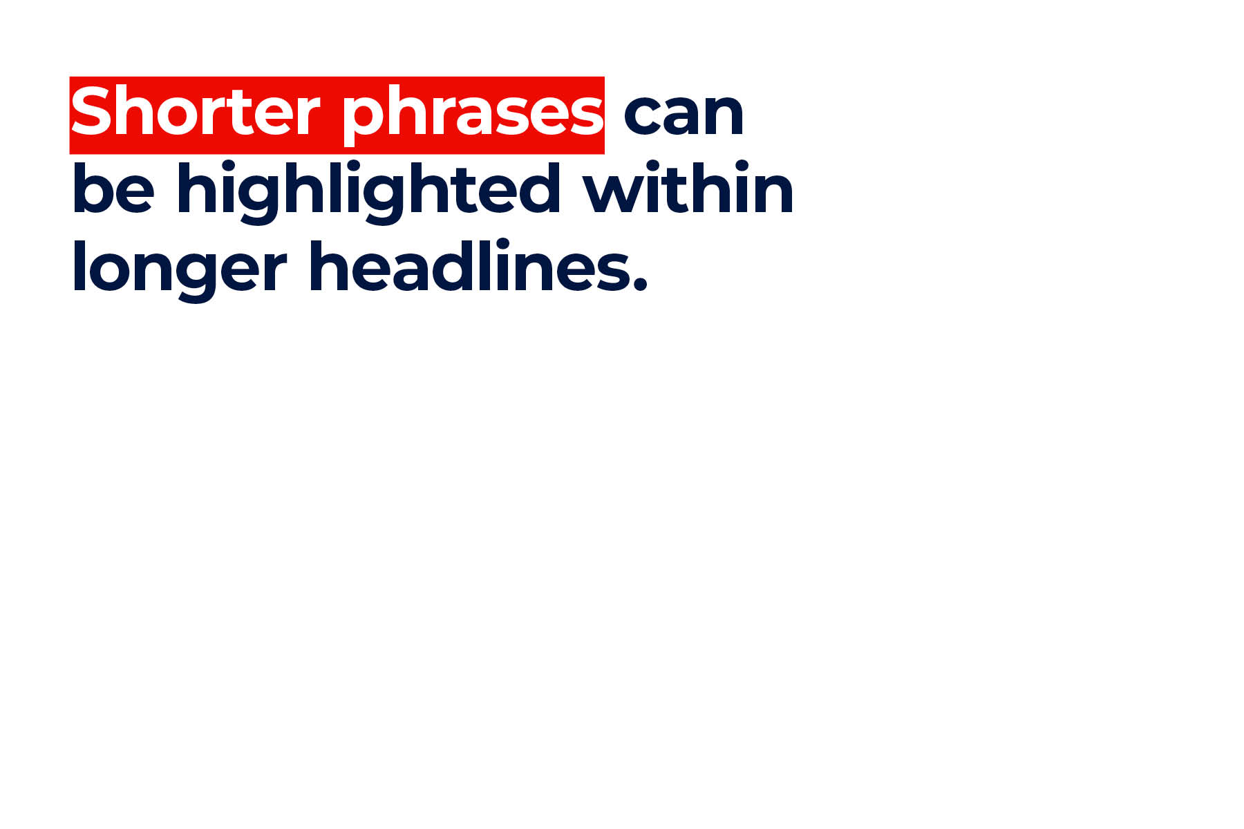
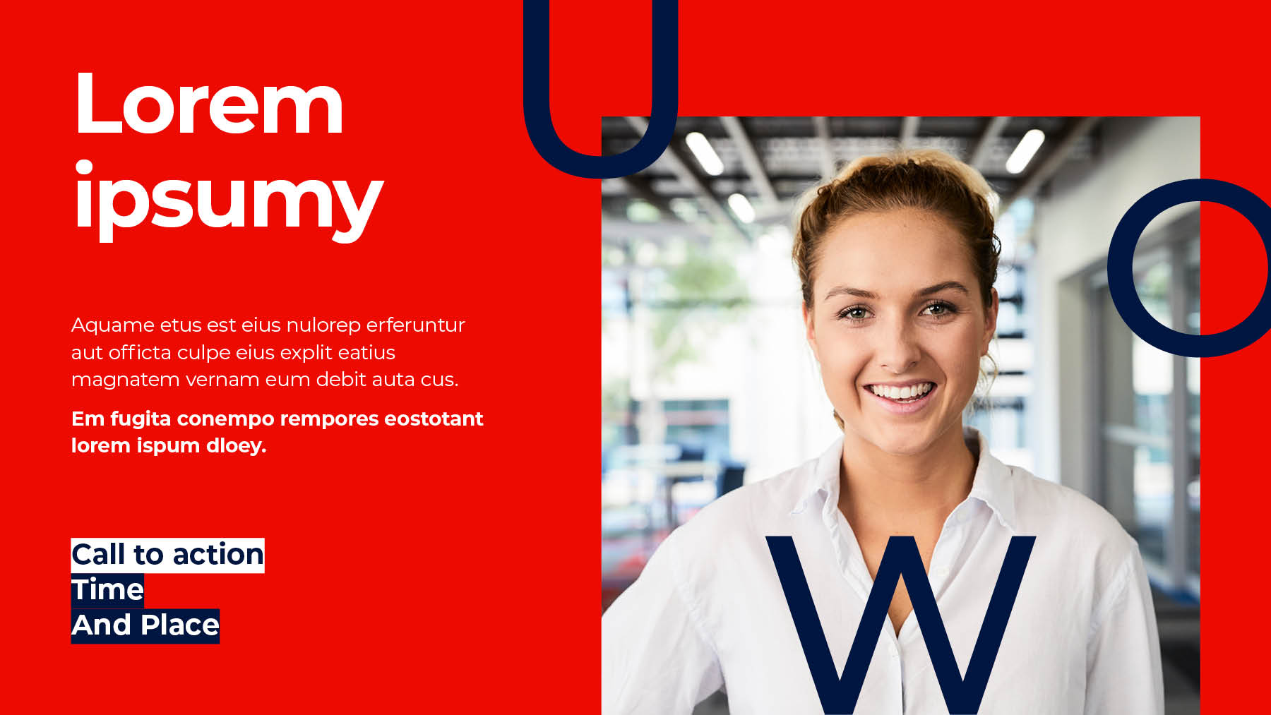
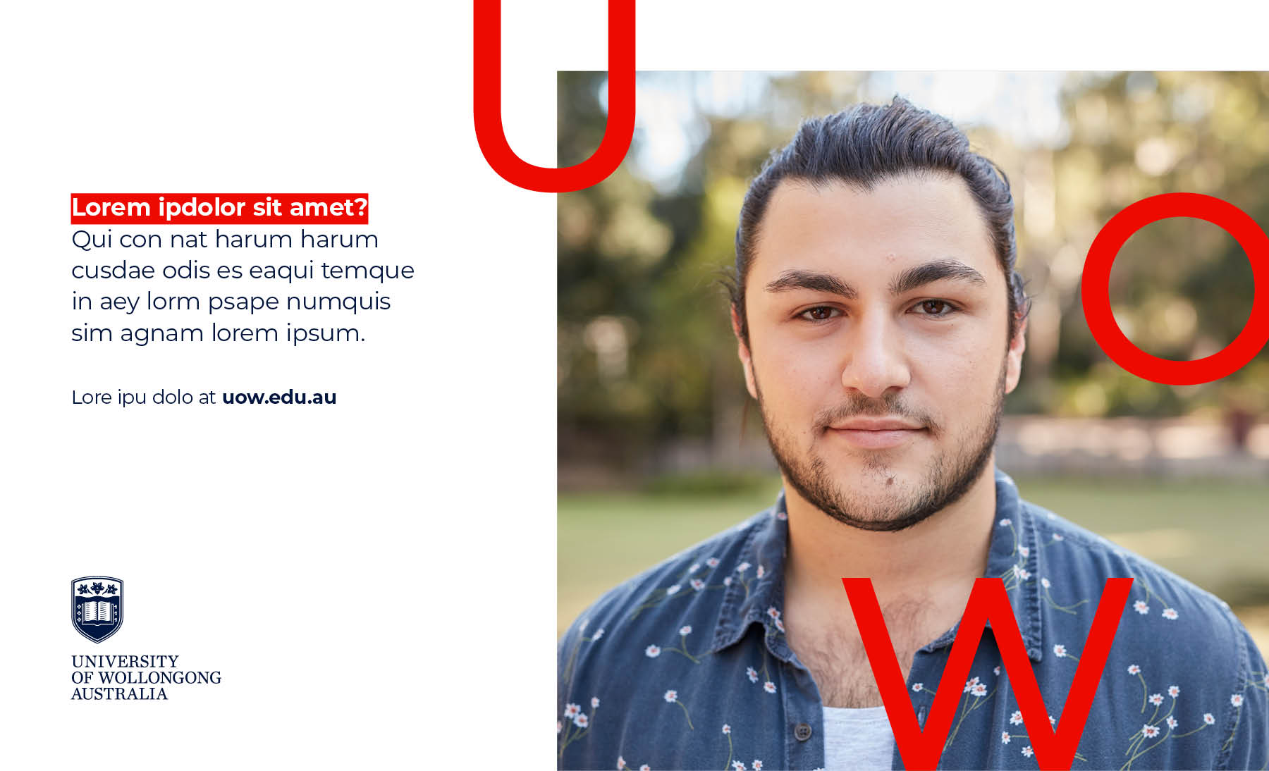
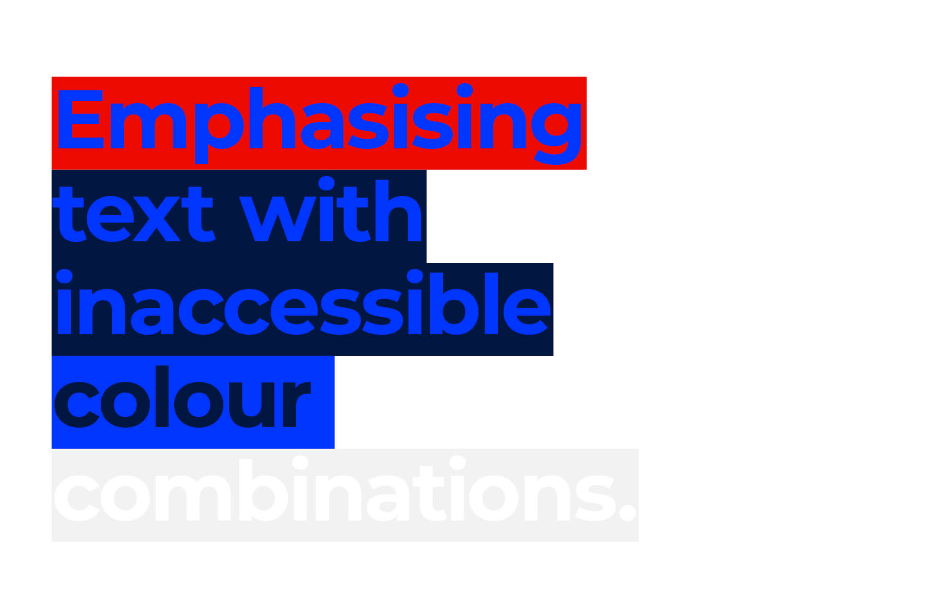
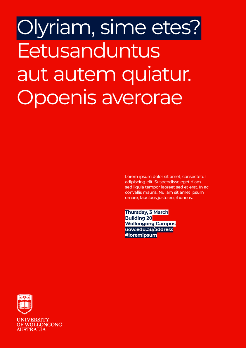
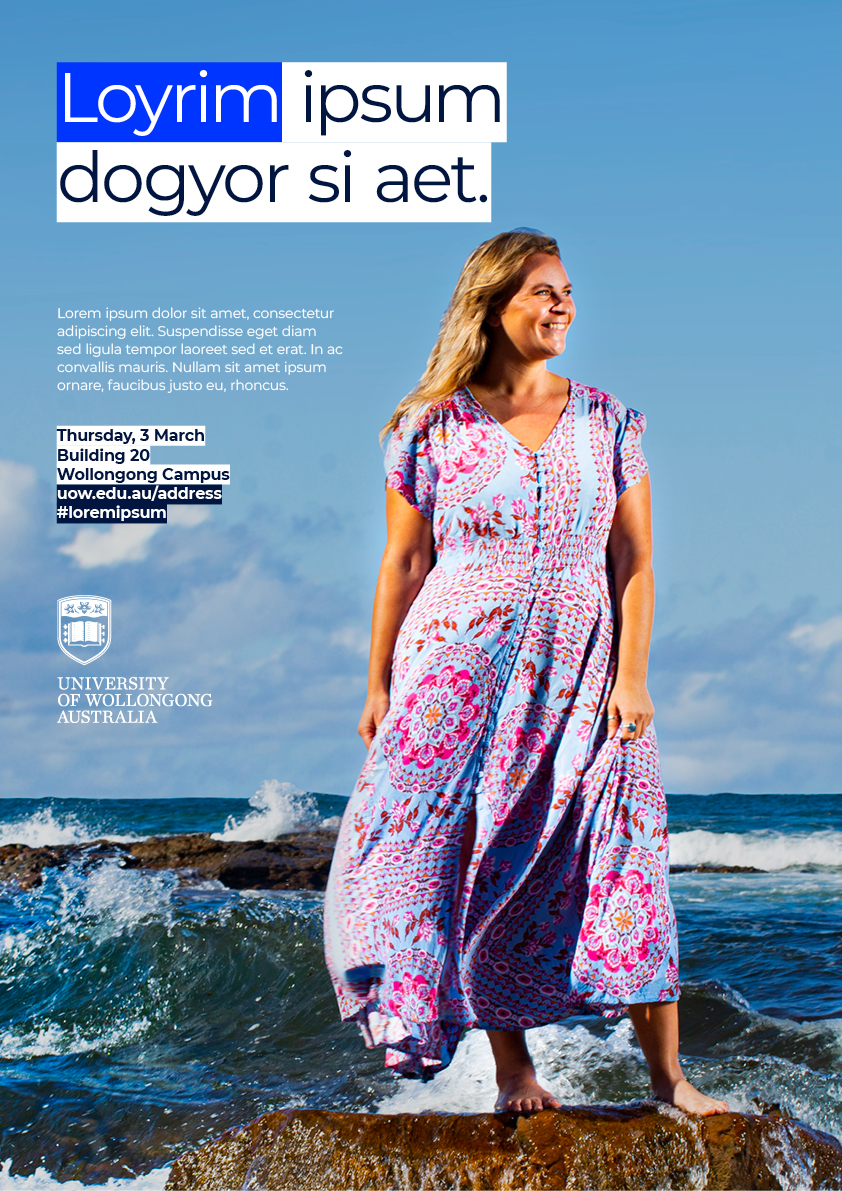
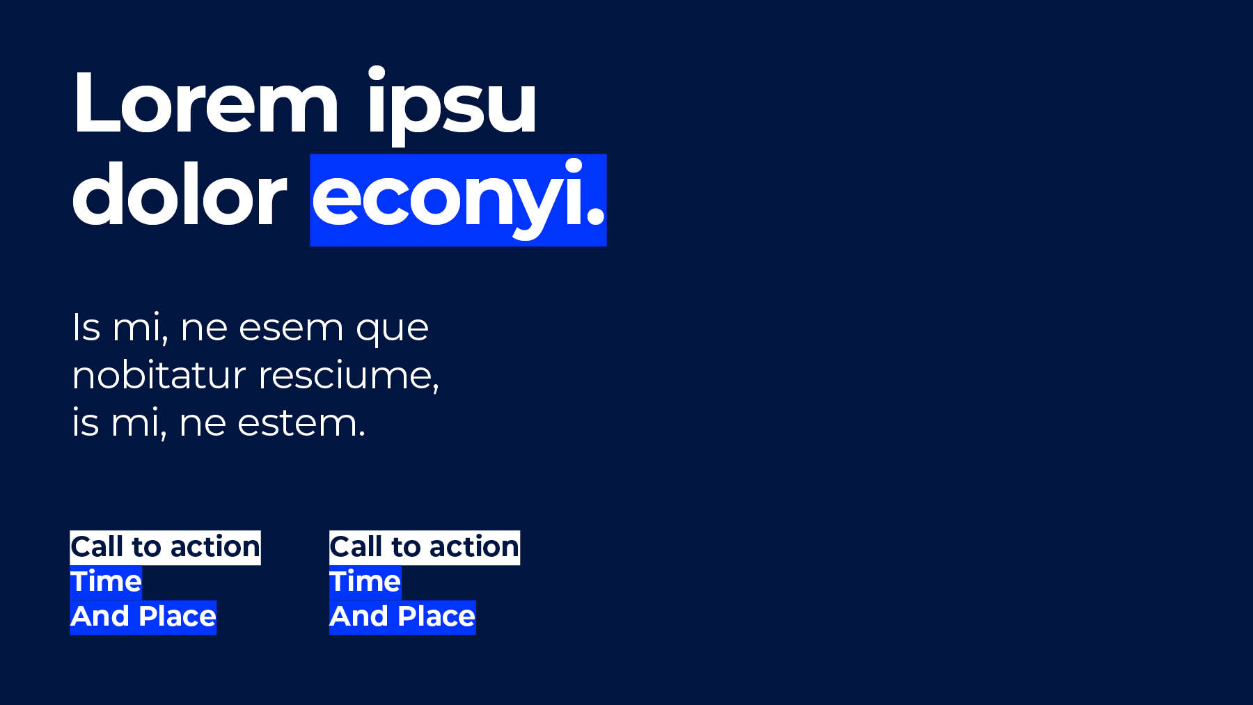
The first applies when emphasising short phrases or single words within a paragraph. In this situation, aim to emphasise approximately 20% of the overall headline with a colour. Brighter colours such as Red or Bright Blue work well against White or Dark Blue and vice versa. Use sparingly as to not overly dominate communications.
Another way to use highlight is when applying highlights to paragraphs that sit over imagery. Here, they provide legibility and stand-out to a message. As a general rule, use a White or Dark Blue underline and emphasise with either Red or Bright Blue.


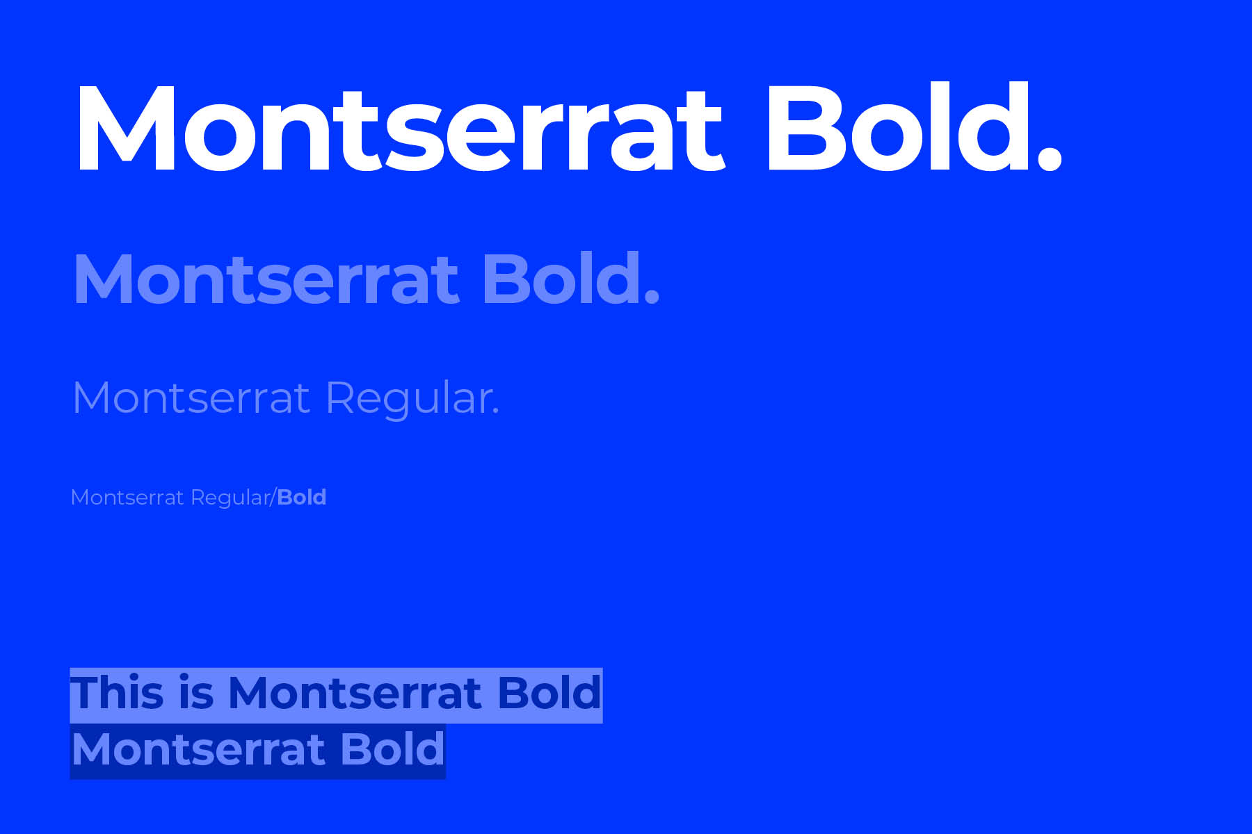
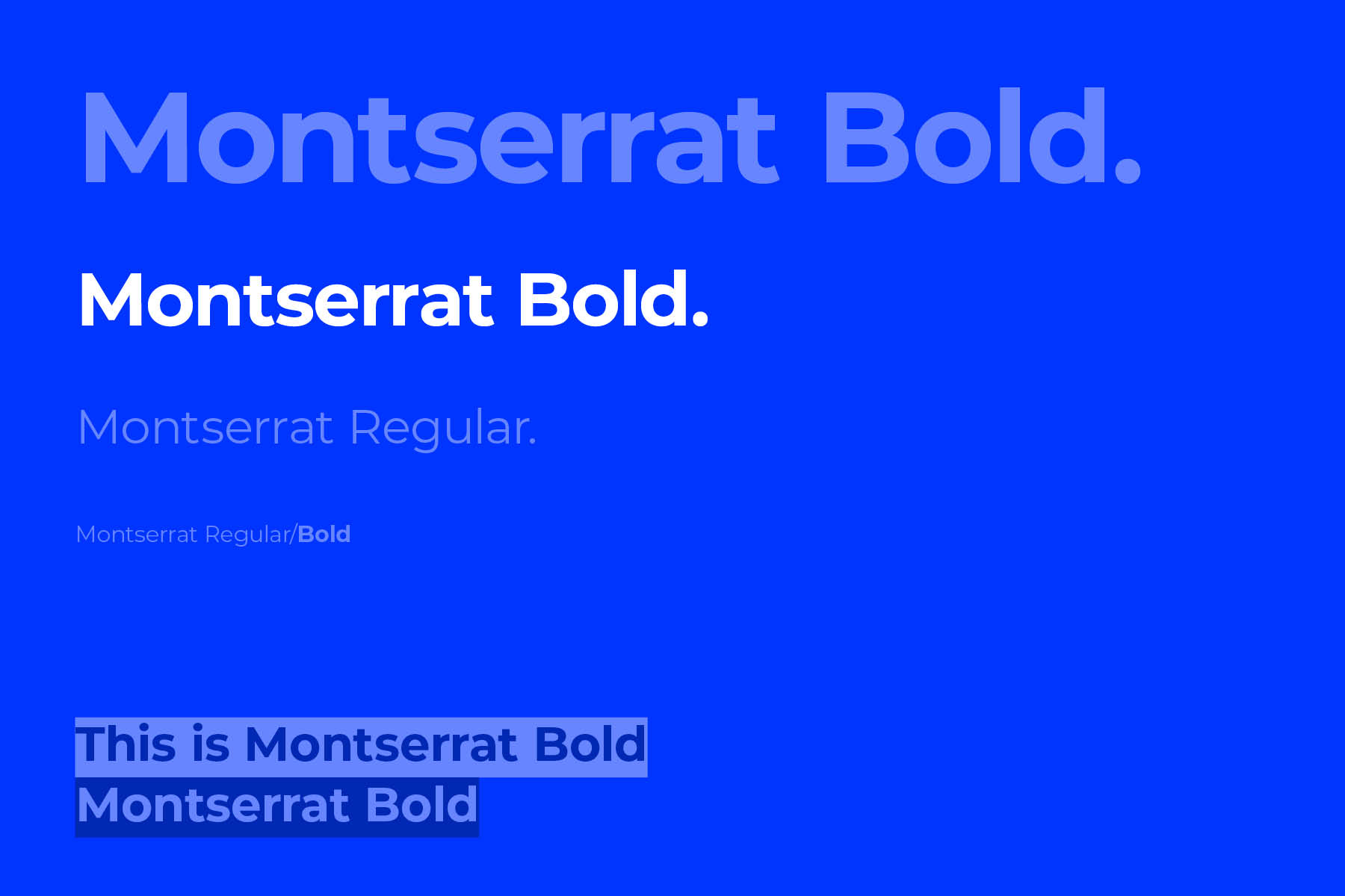
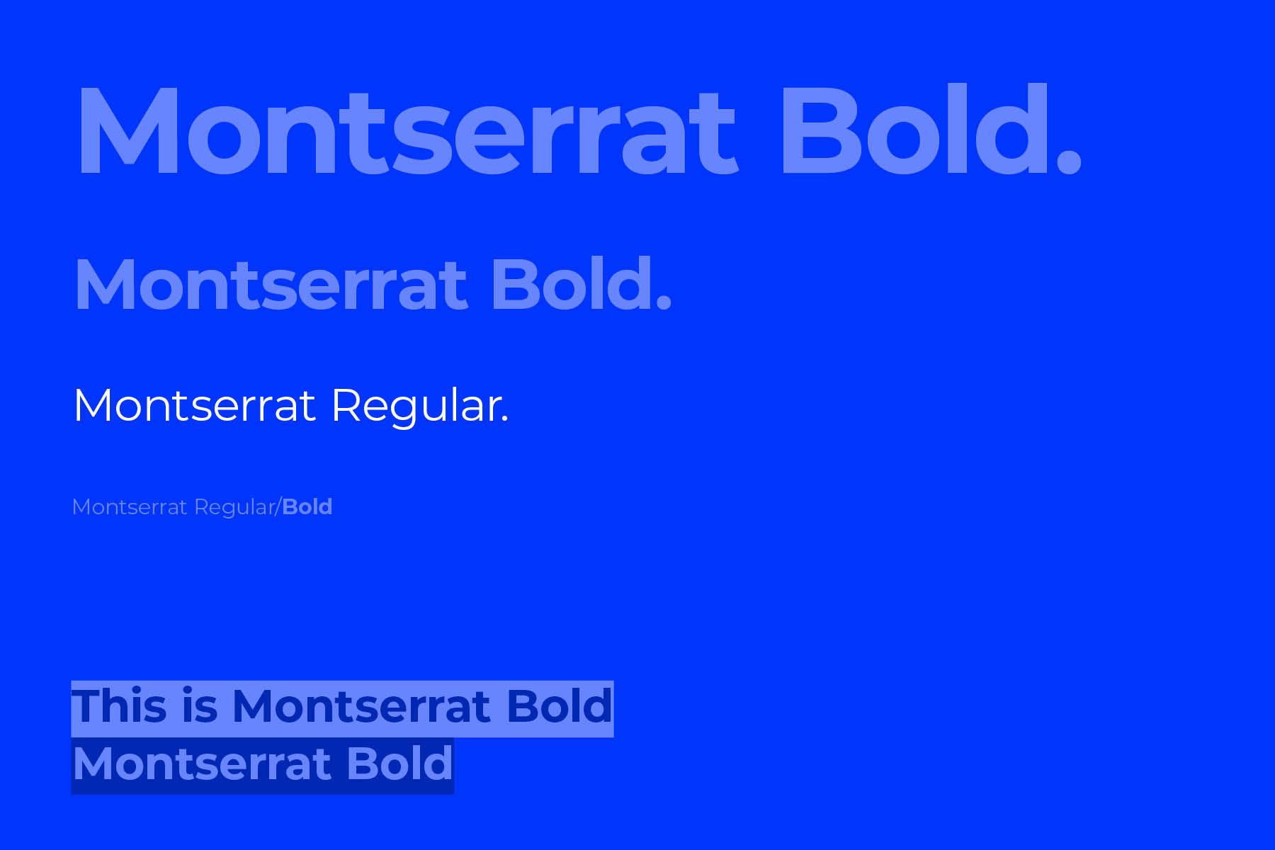
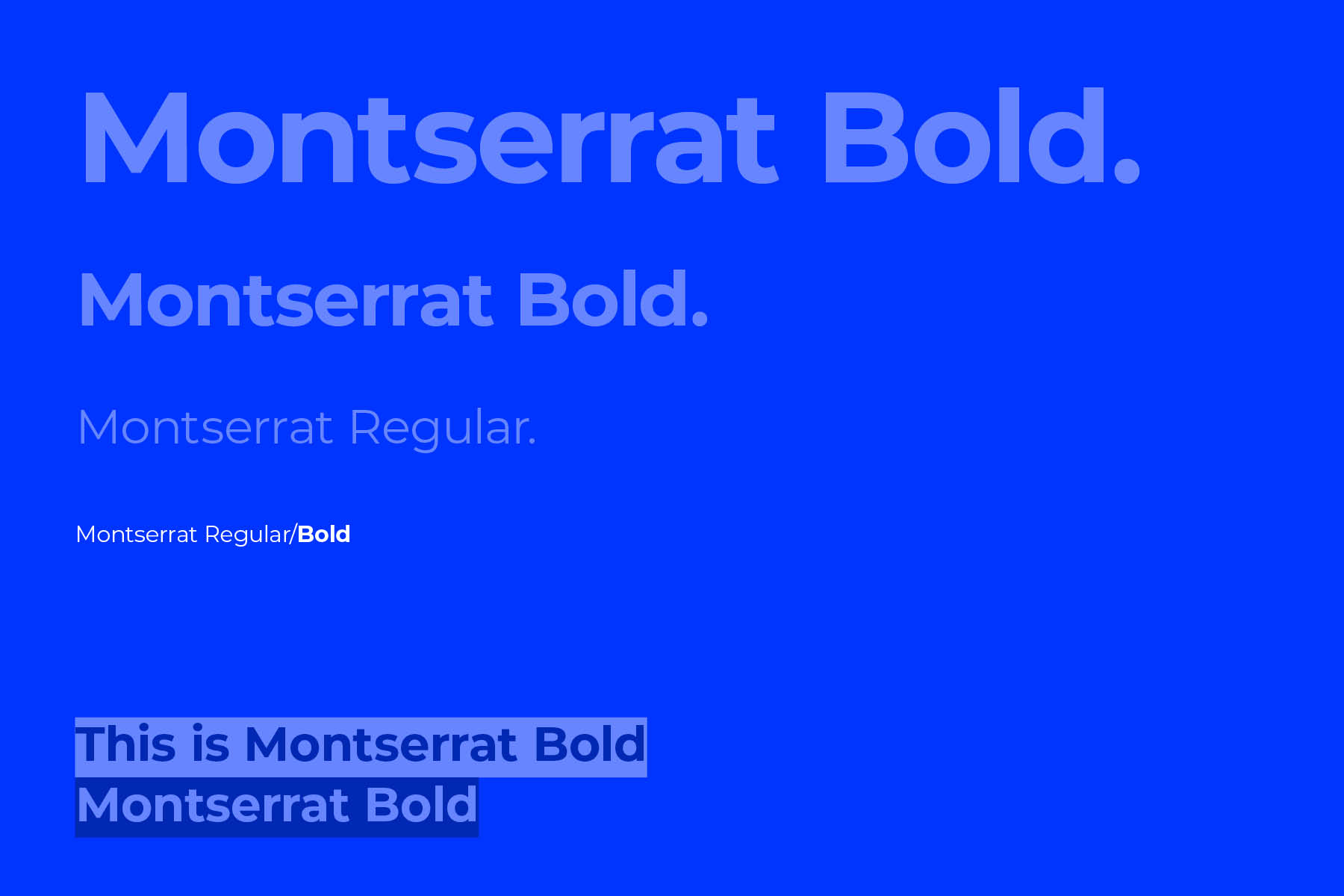
Hierarchy
Utilising the different weights of our primary typeface, we can create an ordered hierarchy across communications. The number of typefaces in the used will depend on the number of levels required.
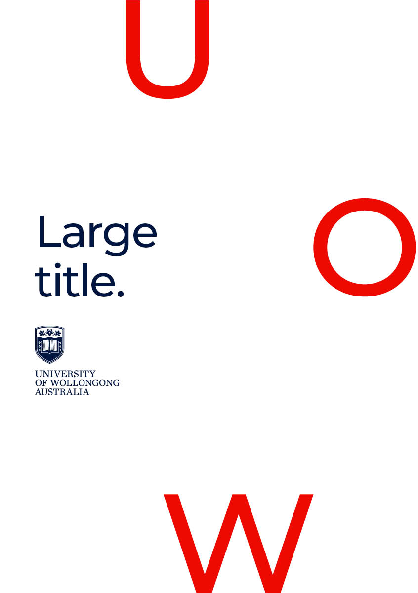
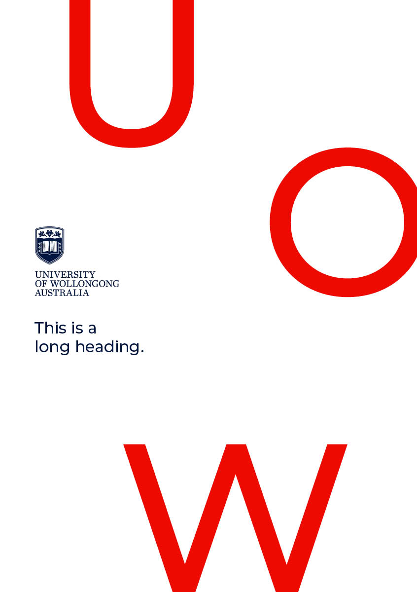
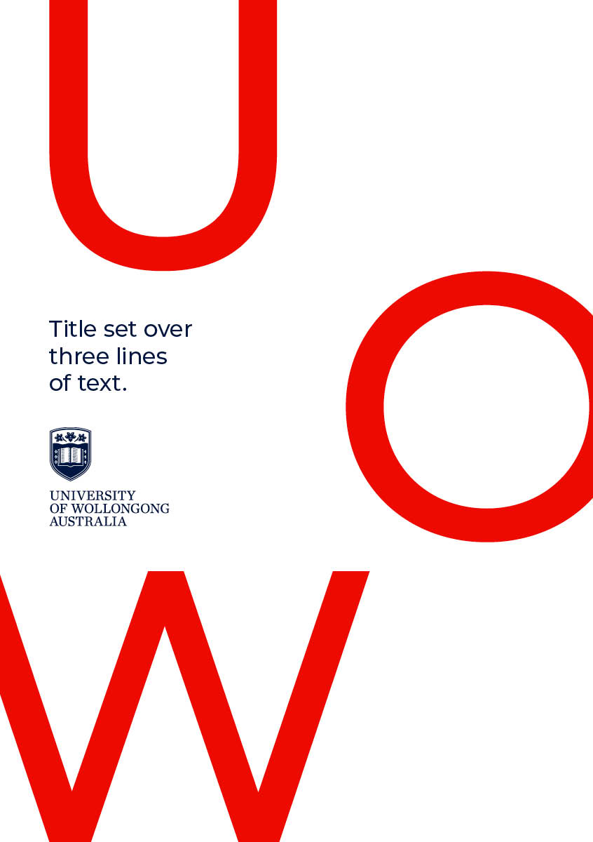
Examples

Typography with framework
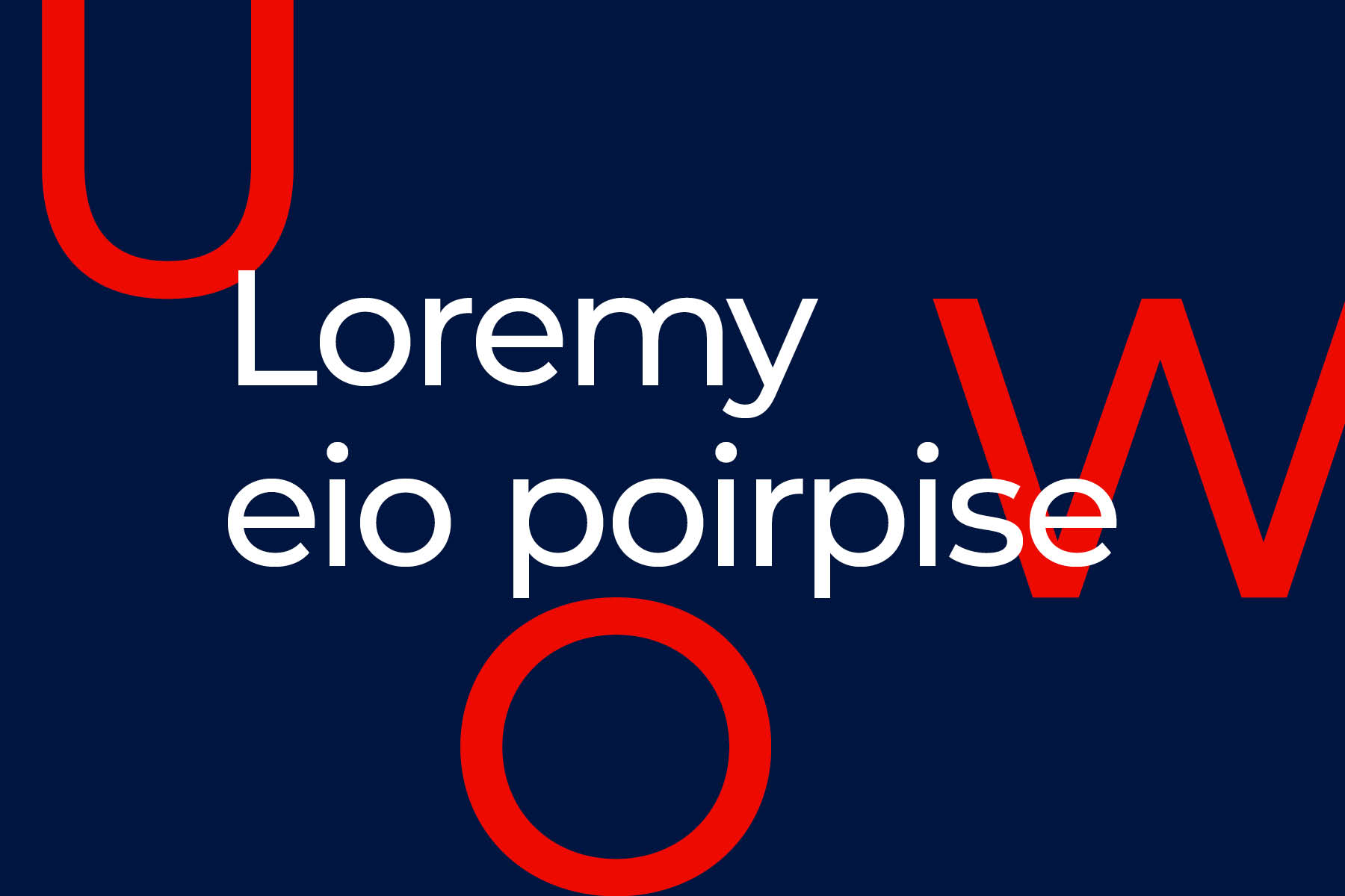
Typography works in a flexible way with the UOW framework. It can be positioned centred or ranged left, provided that it feels framed in some way. Elements can interchange and adapt across communications as shown below.
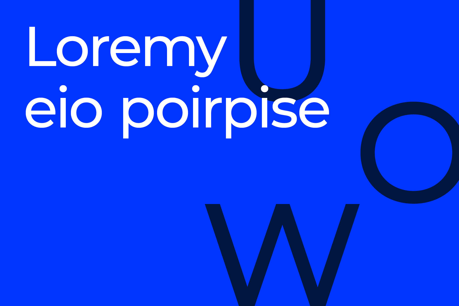
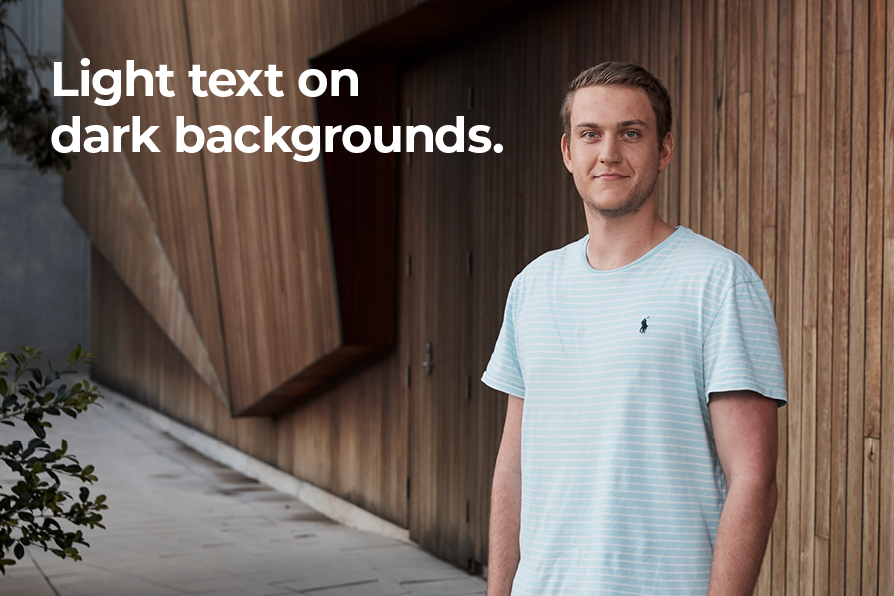
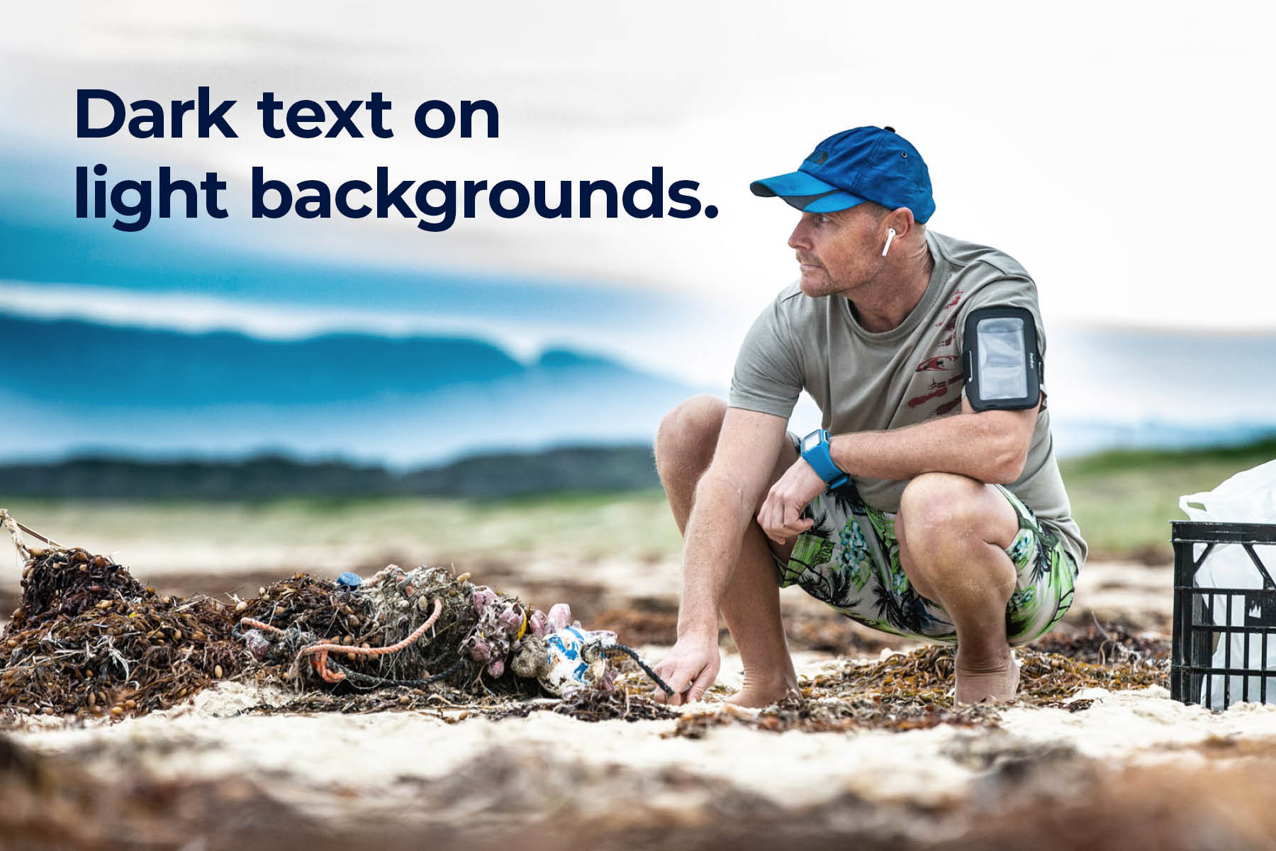
Typography with image
Ensure to retain legibility of type if placing directly on to imagery or footage. As a general rule, use light text on dark backgrounds and vice versa.
Guidance


In application
Publication
Posters
Digital Screens
Websites, platforms and applications
For consistent visual styling on UOW digital platforms, including websites, web applications, mobile applications and platforms, please refer to the component style guide. For more information or guidance please email the UOW Brand Inbox.