Colour
Our colours are modern, bold and progressive. They reflect our brand personality and brand values. The strong, credible palette can be used across all areas of communication and reflect a positive and progressive place to learn.
Our colour palette is ‘open’ meaning that we do not colour code by unit, division or faculty. This flexibility means greater choice, expression and diversity.
Refer to this page for official breakdowns and accessibility guidance.
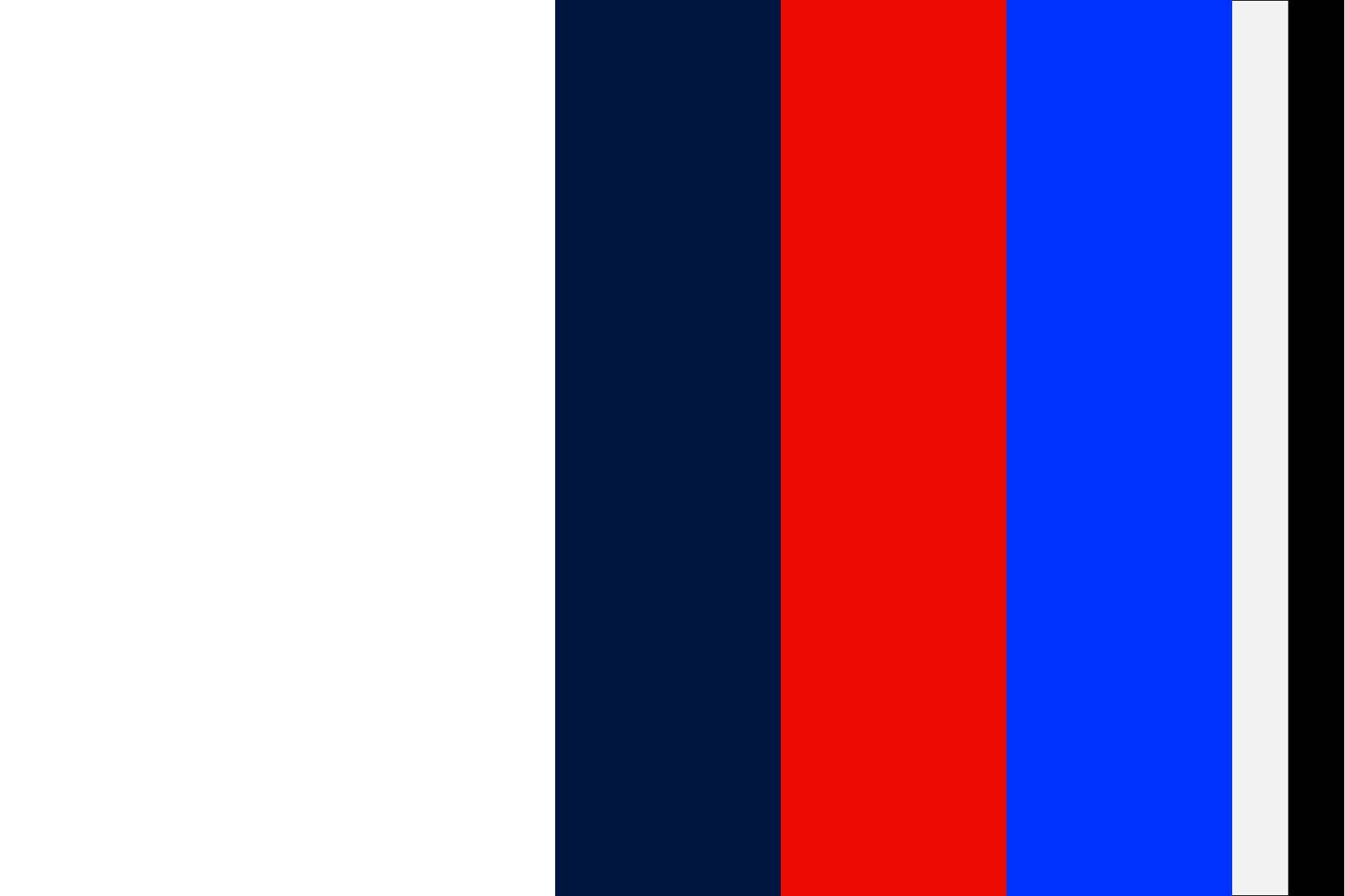
Primary colours
Our primary palette consists of four colours: White, Dark Blue, Red and Bright Blue. Each plays a role across our communications and environments to create engaging experiences through logo, typography, illustration, iconography and image overlay.
White
Web #FFFFFF
CMYK C0 M0 Y0 K0
Avery supreme wrapping: Gloss white
Avery 900 / 700: White
Dark Blue
RGB R0 G22 B65
Web #001641
CMYK C100 M76 Y12 K70
Avery supreme wrapping: Gloss indigo blue
Avery 900: Indigo blue
Avery 700: Alfa blue
Bright Blue
RGB R0 G52 B255
Web #0033FF
CMYK C90 M68 Y0 K0
Avery supreme wrapping: Gloss blue
Avery 900: Vivid blue
Avery 700: Cosmos blue
Red
RGB R237 G10 B0
Web #ED0A00
CMYK C0 M100 Y95 K0
Avery supreme wrapping: Gloss red
Avery 900: Medium red
Avery 700: Bright red
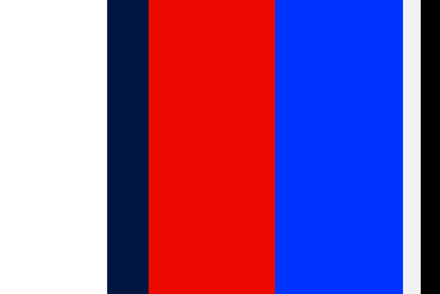
Secondary colours
Our secondary colour palette is used in support of our primary palette when limited colour application is available. In this situation, Black replaces Dark Blue and Light Grey can be used as an alternative background colour to white.
Black
RGB R0 G0 B0
Web #000000
CMYK C0 M0 Y0 K100
Avery supreme wrapping: Gloss black
Avery 900/700: Black
Light grey
RGB R242 G2421 B242
Web #F2F2F2
CMYK C0 M0 Y0 K10
Avery supreme wrapping: Gloss grey
Avery 900: Dove grey
Avery 700: Contact UOW marketing
Accessibility
To comply with WCAG 2.0 accessibility guidelines, the examples below indicate which colour combinations pass either AA or AAA contrast for onscreen application. The combinations shown refer to both large and normal text unless otherwise indicated.
AAA Dark blue
AAA Black
AA Red
AAA Bright blue
AA White
AA Dark blue (large text only)
AA Black
AA Light grey (large text only)
AAA White
AAA Light grey
AA Red (large text only)
AAA White
AA Light grey
AAA White
AA Red
AA Light grey
AAA Dark blue
AAA Black
AA Red
AA Bright blue
Usage proportions
As a general rule, White should be given a greater proportion of use over the remaining primary colours. In certain situations, such as at events or when creating ‘campaign-focused’ communications, bolder colours such as Red and Bright Blue can be increased over Dark Blue for stand-out and impact.
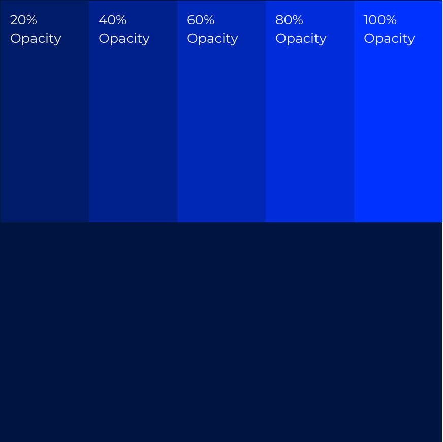
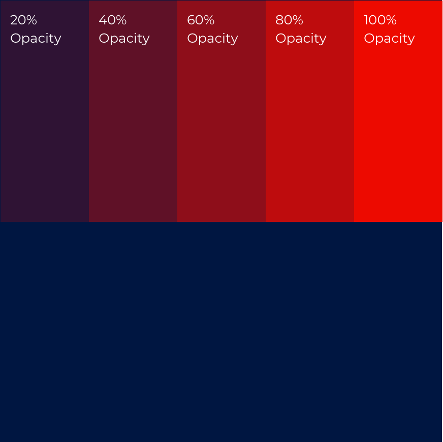
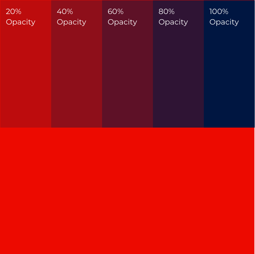
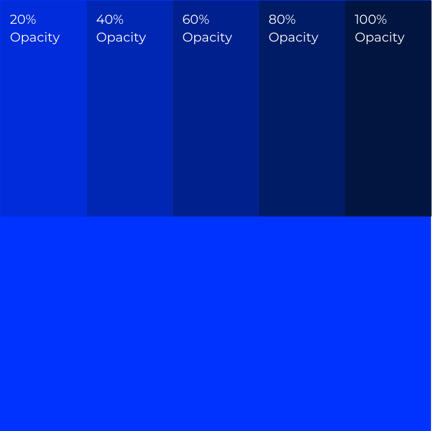
Overlaying colour
The primary palette can be combined using opacity changes to create depth and dimension to applications such as graphic illustration. Effects will vary depending on the software. Opacity shown below are indicative and can be used as a guide.
Examples


Guidance


In application
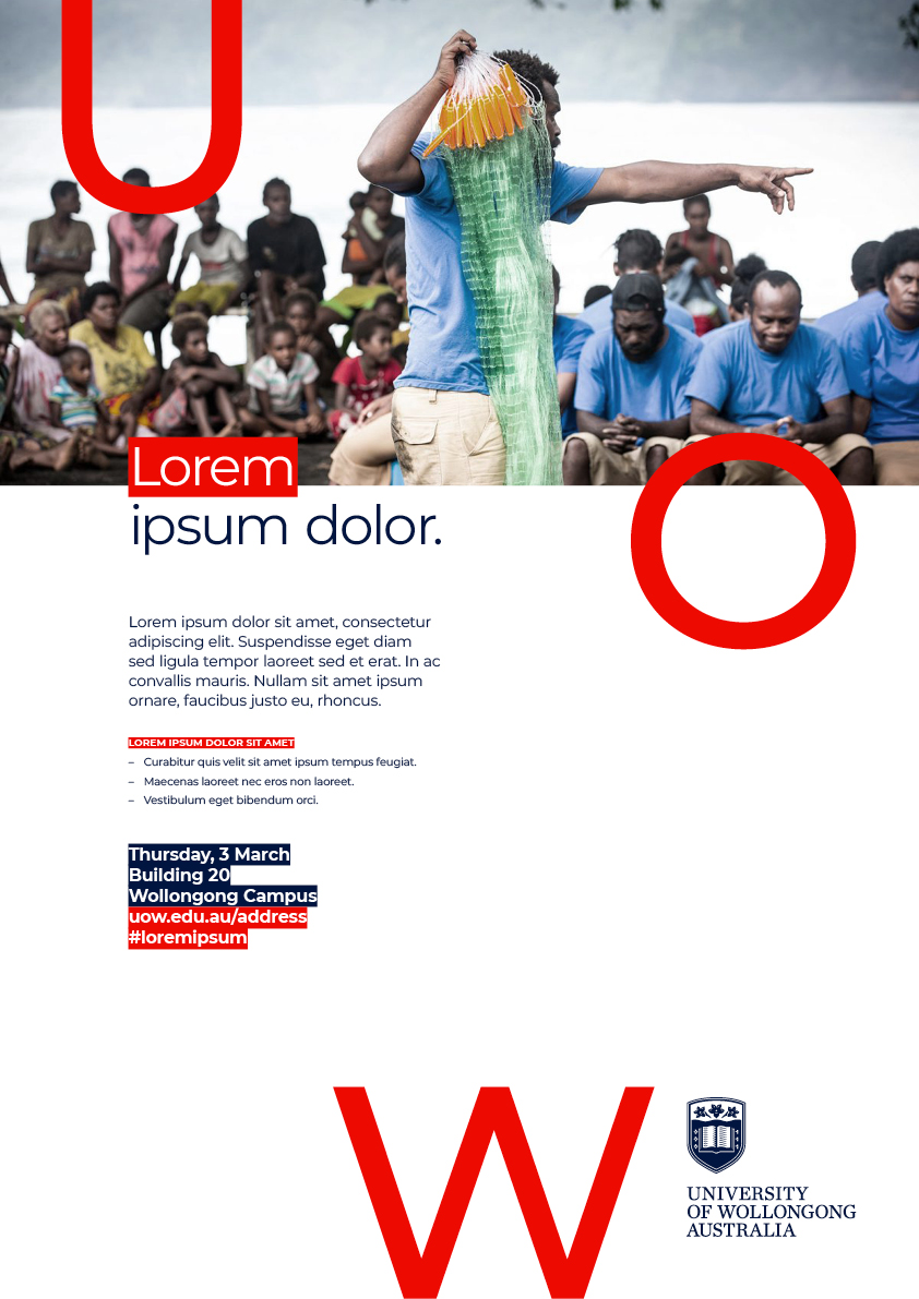
Poster
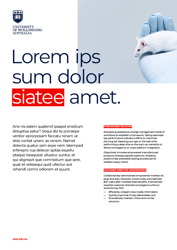
Flyer
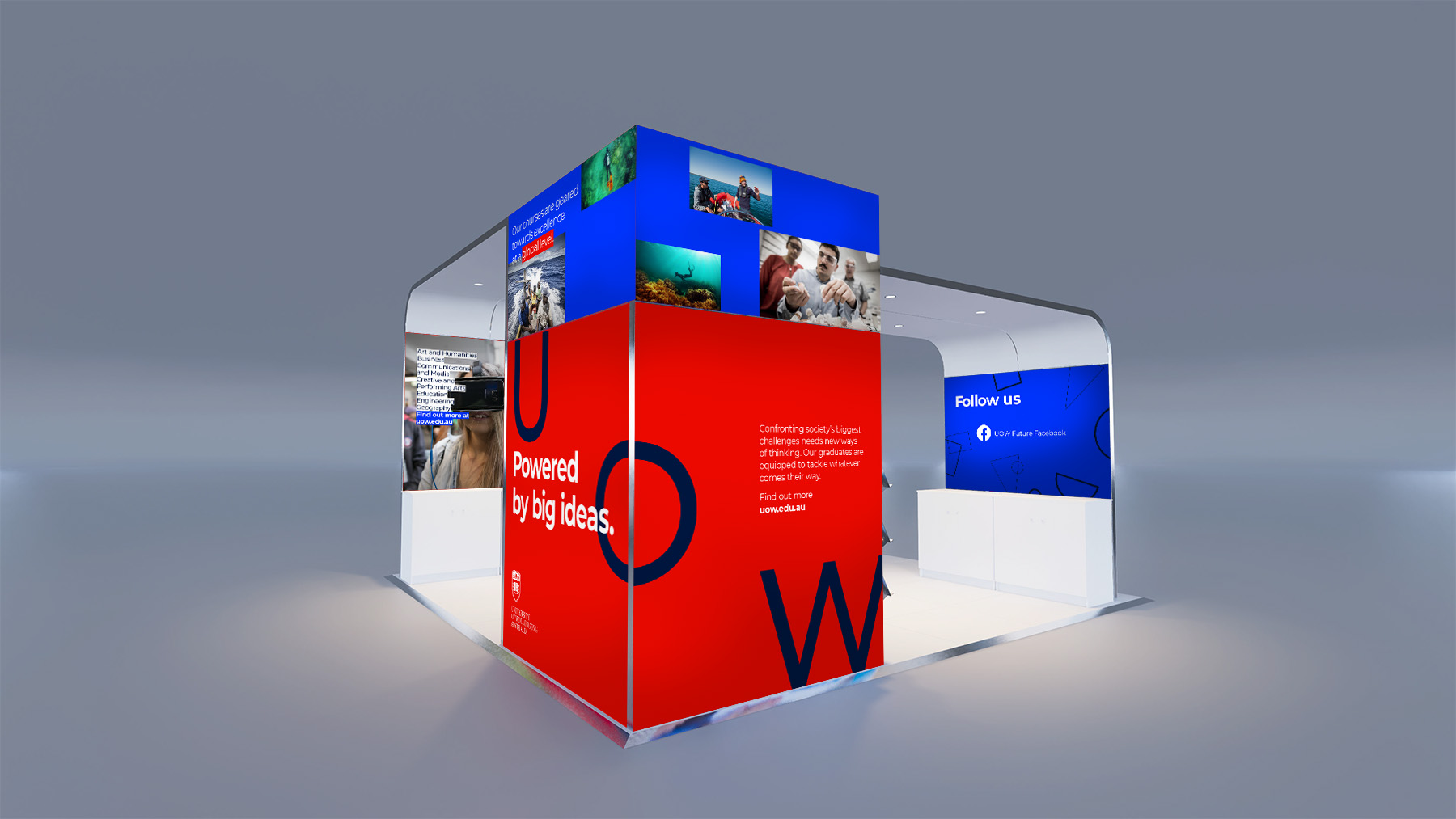
Event Stand