Iconography
The UOW icon suite is an extension of the UOW brand personality and is used across a wide range of applications such as digital, print and physical spaces. Icons may be used in a similar way to paragraph breaks: they visually break up the content, making it less intimidating for users. Accent paragraphs or chunks of text with icons, to support content delivery and understanding. Icons must not be used where images should be used, or treated as a 'logo'. The UOW icon suite is available within UOW's official brand templates (designer kit).
Request designer kitTypes of icons
There are three main types of icons in use across UOW shown below.
Area of Study

Topical

System

Area of study icons
These icons are used to identify UOW study areas. Shown below are the 18 study areas and their icon. These icons are only to be used in relation to the study area and are used across digital and print.


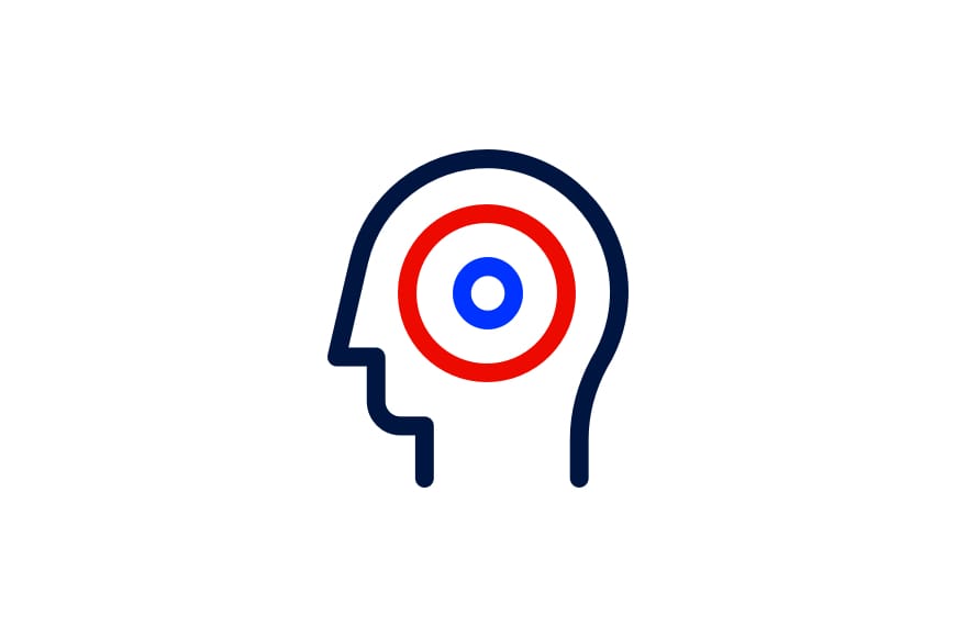
Topical icons
Topical icons are used to aid communication and to better contextualise messaging as shorthand. These icons can be paired with any appropriate messaging and can be used anywhere.


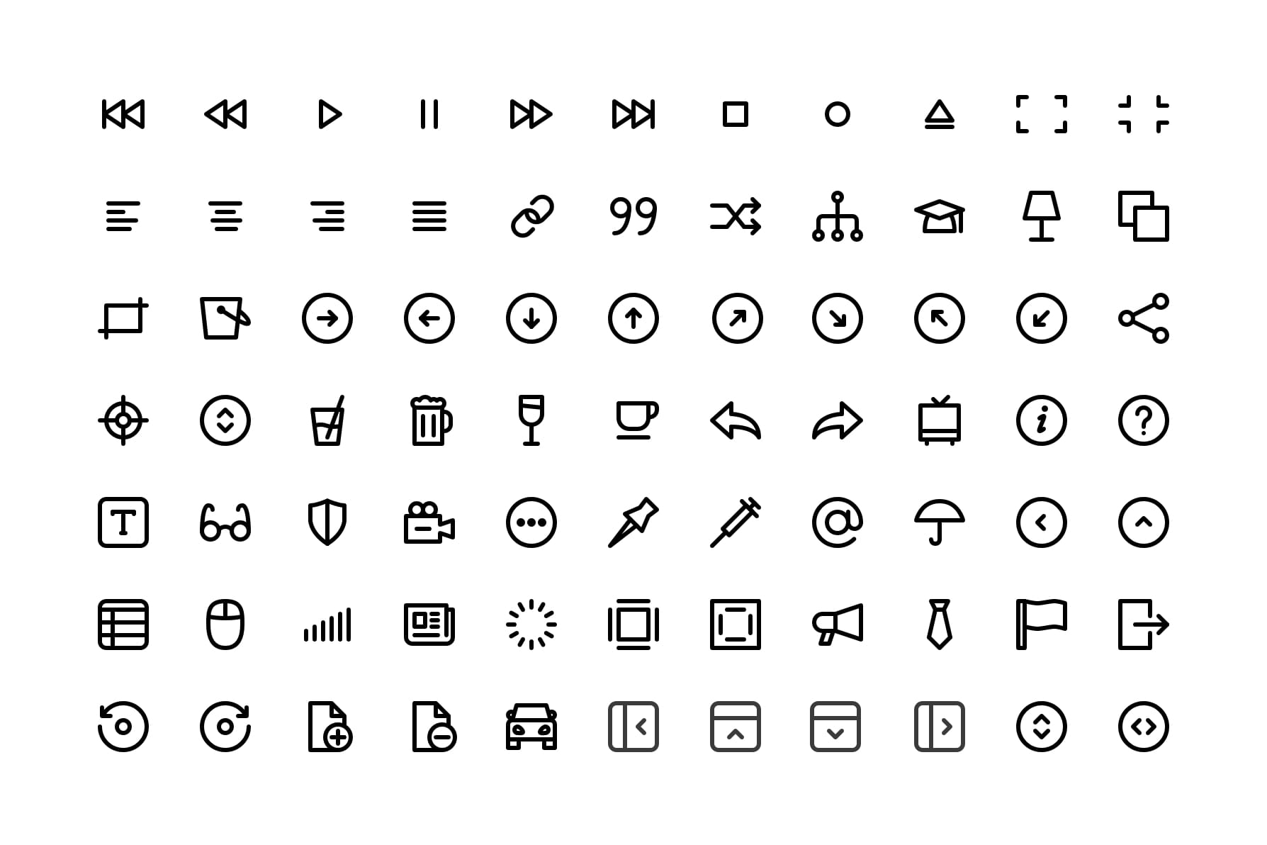
System icons
In addition to study area and topical icons, a suite of system icons exist to aid in user interaction in digital applications.
Construction
All icons in the UOW icon suite are constructed using a single line weight and feature rounded terminals and corners. Where possible, icons should be designed using an 8x8 grid shown below, however it’s acceptable to go beyond the padding of the key lines if doing so improves the optical balance of the icon.


Guidance
Maintaining our iconography style is key to our brand consistency. Consider the following points of guidance when using icons in communications.


In application
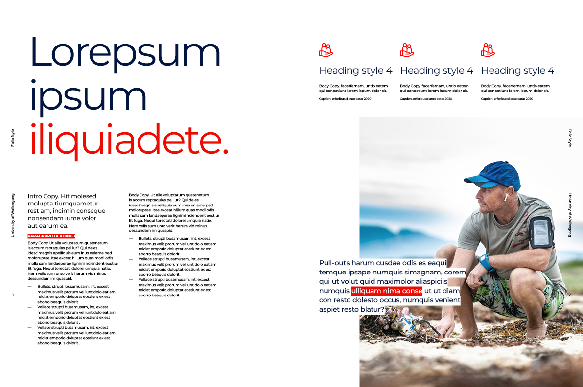
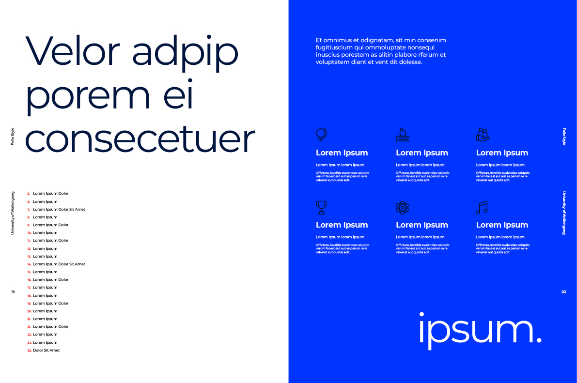
Publications