Managing my course
- Key dates
- Handbook
- Changing a course or campus
- Course progress
- Credit for prior learning
- Digital academic documents (My eQuals)
- Enrolling in subjects
- Enrolling in tutorials
- Offshore campus students
- Official documentation
- Student forms and applications
- Student ID card
- Student policies
- Study loads (full-time / part-time)
- Study overseas
- Taking a leave of absence
- Visa compliance
- Updating personal details
- Withdraw from a course
- Withdraw from a subject
Getting started
My Faculty
Exams & assessment
Library
Study tools & resources
- Academic skills and study support
- Self-help study and assessment resources
- Digital Skills Hub
- Learning and study skills consultations
- Peer Assisted Study Session (PASS)
Personal development
International students
Personal support
- 24-hour Wellbeing Support Line
- Support and Wellbeing services
- Legal support
- Counselling services
- Student Accessibility (Disability Services)
- Student advocacy
- Student Ombudsman
- Student Support Coordinators
- Violence, abuse or harassment support
- Wollongong Campus Medical Centre
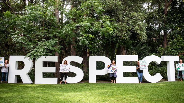
Respect
Safety
Financial support
Woolyungah Indigenous Centre (WIC)
IT services
- Systems scheduled maintenance
- Printing and copying
- Request IT help
- SOLS help
- Computer labs
- UOWmail
- Wi-Fi and internet
Get in touch
What's on
Your UniLife
Getting around
Health & wellness
- Support and wellbeing
- Overseas student health cover
- Sport and wellness activities
- Student Mental Health Services
- UniActive Gym
- 24-hour Wellbeing Support Line